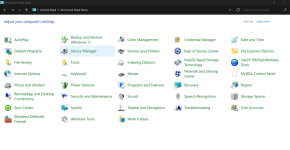
Microsoft formally deprecates the 39-year-old Windows Control Panel
- Thread starter JournalBot
- Start date
fuzzyfuzzyfungus
Ars Legatus Legionis
By "streamlined experience" I assume they are politely referring to Settings' ongoing inability to reach feature parity with what it's supposed to replace?
Upvote
957
(966
/
-9)
Microsoft hasn't done a particularly good job so far of making sure that they have created a new method to access functions before removing the old way, so I can't imagine it's going to be a smooth transition when they remove the old ways en masse. But at least the new menus will be prettier.
Upvote
334
(339
/
-5)
What I find most darkly amusing is that digging deep enough into the Settings app still pulls up screens that come from the Control Panel.
Upvote
629
(629
/
0)
Me too, because it's where the controls that actually do something are located.Maybe it was just familiarity, but I have always preferred the control panel to the settings app
Upvote
538
(539
/
-1)
Exactly. Better brush up on your *.cpl command lines, folks.By "streamlined experience" I assume they are politely referring to Settings' ongoing inability to reach feature parity with what it's supposed to replace?
Upvote
225
(227
/
-2)
original_mds
Ars Tribunus Militum
Windows UI dumbing down for desktop use is one of the more irksome trends of the last 20 years, IMO. Peak useability was probably reached in the mid 2000s.
Edit. I am somewhat amazed that there are over 150 upvotes on this comment with zero downvotes. I realized the sentiment was widespread, but did not think that advocates for the evolution in the desktop UI since then would be non-existent.
Edit. I am somewhat amazed that there are over 150 upvotes on this comment with zero downvotes. I realized the sentiment was widespread, but did not think that advocates for the evolution in the desktop UI since then would be non-existent.
Last edited:
Upvote
489
(504
/
-15)
A_Very_Tired_Geek
Ars Tribunus Militum
Not just familiarity. Settings doesn't duplicate the functionality when it comes to non-trivial configuration options. It might in the future, but for now it's a very distant second.Maybe it was just familiarity, but I have always preferred the control panel to the settings app
Upvote
387
(387
/
0)
Windows UI dumbing down for desktop use is one of the more irksome trends of the last 20 years, IMO. Peak useability was probably reached in the mid 2000s.
I much preferred when the business and home lines of OS were separate.. Win2K Pro will always be peak Windows for me.
Upvote
146
(158
/
-12)
Ahem Credential Manager? Especially in today's M365 world?
You can take Control Panel when you grant us all of the...controls it was capable of.
You can take Control Panel when you grant us all of the...controls it was capable of.
Upvote
266
(266
/
0)
Having just spent two weekends trying to sort out audio interfaces, there are still a lot of things you can’t do in the settings app and you need that control panel.
They had better have all that sorted out first.
Who am I kidding.
They had better have all that sorted out first.
Who am I kidding.
Upvote
320
(320
/
0)
That'll suck for me. I start Control Panel and hit the up-arrow in the interface twice as soon as I log in at work. That's the simplest (and completely built in for bonus points) way I've found to get WIn10 File Manager in Win11. It's a tiny thing, but they moved the navigation header around and my muscle memory really, really hates it.
Upvote
99
(100
/
-1)
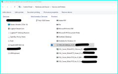
As an I.T Tech support specialist that spends a lot of my day opening control panel this change has been super annoying and time consuming. For instance, I had a user that had 27 printers installed, old printers, dead printers etc. Removing the printers from the new Settings Menu was absolutely terrible. Each printer appears in a list, however, I cannot right click for any quick options, I have to select the printer which loads a new page then remove, go through UAC prompt and then wait for the "printers & scanners page " to reload at the very top. Then scroll down the bottom and repeat this process for 26 printers! By the 5th printer removal, the " Printers & Scanners page" would start to hang and I would have to close the settings page and open a new instance.
For those who hate this and want to old Control panel interface, still possible to force it to open. Navigate via Control Panel --> System and Security --> Hardwar and sound (left hand side) --> Right click " Devices and Printers " and select " Open in new window " and this will open the old control panel view of your installed printers, which I can right click and select " remove " and very efficiently clean up a users computer.
Screen shot of my Printer list displayed in old UI on windows 11

Upvote
365
(365
/
0)
Dark Pumpkin
Ars Scholae Palatinae
Microsoft must define the phrase "Streamlined experience" as:
An experience where you waste 5-10 minutes digging through menus trying to find a setting, only to realize it still doesn't exist in the new app after all these years.
An experience where you waste 5-10 minutes digging through menus trying to find a setting, only to realize it still doesn't exist in the new app after all these years.
Upvote
475
(475
/
0)
If Logitech has their way with mice you'll want to brush up on command in general.Exactly. Better brush up on your *.cpl command lines, folks.
Upvote
91
(93
/
-2)
fuzzyfuzzyfungus
Ars Legatus Legionis
Just wait until they decide to offer a newer, cooler, experience by replacing both with Copilot quietly cobbling together bad-old-days-of-VBA-and-rundll32 invocations in the background to attempt to programmatically twiddle the legacy CPL items in response to your pleas without you needing to see that they are still there.Exactly. Better brush up on your *.cpl command lines, folks.
It'll be highly reliable.
Upvote
121
(121
/
0)
stormcrash
Ars Tribunus Angusticlavius
I guess my memory was wrong and it isn't a control panel, but there are still file open dialogs dating back to NT 3/Windows 3.1
I'm going to miss he old simple control panels, they harken back to a simpler and more magical time in computing, one that was both wonderous and frustrating (crashes, DLL hell etc). They may be simple, they aren't flashy, but they were usable and got the job done with no fuss
I'm going to miss he old simple control panels, they harken back to a simpler and more magical time in computing, one that was both wonderous and frustrating (crashes, DLL hell etc). They may be simple, they aren't flashy, but they were usable and got the job done with no fuss
Upvote
80
(80
/
0)
What blows my mind more than ms doing something nobody asked for, is they have been making this change over the course of what? 5-10 years now . Wtf
Upvote
169
(170
/
-1)
GopherMobile
Ars Scholae Palatinae
Going to agree with others that they need to replicate more of the features in the new settings before getting rid of Control Panel. I'm not against change, and don't even mind the new settings panel, but there's still so much that I do in Control Panel that's missing in Settings.
Upvote
119
(119
/
0)
Microsoft also deprecated desktop gadgets, which are phenomenally useful for reminders and for things you need to monitor. They have never created an adequate substitute. There's a huge difference between something that is there for you to glance at all the time versus something you have to bring up a menu from the task bar to see. That just substitutes a whole new way to forget. Nevertheless, I currently have several gadgets on my Windows screen right now, the most important of which are date and time, weather, a clipboard manager and a Google calendar reminder. That's because the free software community created an app called 8gadget, in which the desktop gadgets run. I have no doubt they will do the same for a control panel replacement. Frankly, the settings app is poorly organized and makes it way too difficult to find the setting you want. And half the time, it just dumps you into the same settings window that Control Panel would also have used. Sure, it looks swoopy, but the functionality is the same or worse.
Upvote
69
(72
/
-3)
Post content hidden for low score.
Show…
That was also peak user skills. People I work with have forgotten how to use file explorer to access their files, let alone figure out where they downloaded them to.Windows UI dumbing down for desktop use is one of the more irksome trends of the last 20 years, IMO. Peak useability was probably reached in the mid 2000s.
Upvote
146
(147
/
-1)
If you click on System, then click Advanced System Settings, it opens a Control Panel applet which has many more settings that let you fine tune many aspects of Windows. If these tweaks disappear, I hope a third-party releases a way to continue to access them.
Upvote
38
(38
/
0)
scottwsx96
Ars Tribunus Militum
It's been awhile since I've seen it myself, but occassionally in modern Windows you'll hit one of those Win 3.11 control panel applets that makes you select the drive letter (only) from a separate drop-down menu before being able to select from a file or folder in a separate pane.I guess my memory was wrong and it isn't a control panel, but there are still file open dialogs dating back to NT 3/Windows 3.1
I'm going to miss he old simple control panels, they harken back to a simpler and more magical time in computing, one that was both wonderous and frustrating (crashes, DLL hell etc). They may be simple, they aren't flashy, but they were usable and got the job done with no fuss
Edit: Confirmed they apparently still exist in Windows 11!
Upvote
73
(73
/
0)
Yeah, this is bad news for me. I spend just enough time trying to dodge Settings and find my way back to the actually-useful Control Panel screens that this is going to hurt. It's the same as they did with all the context menus in Win 11 - it's all about suggesting what it thinks you want to do, while relegating the things you do actually want to do to abstractions and layers of menus.Not just familiarity. Settings doesn't duplicate the functionality when it comes to non-trivial configuration options. It might in the future, but for now it's a very distant second.
To test this just now, I tried to get to a Windows-controlled screen to make sure my speaker configuration is 5.1, and it's in System->Sound->Advanced->More audio settings, which brings up the Win7 nee Win98-style view of devices:
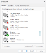
I had a rant prepared about how this was worse than Control Panel, but honestly it's just about the same number of clicks, just maybe less intuitive for a three-decade user. I'm not sure why this functionality can't just be part of Audio settings, though.
What does still worry me about this is that they won't even try to hit feature parity with Control Panel and just pave over vital options on the presumption that everything always works all the time. Will the above screen, which is actually useful, still be accessible? If it and others like it are still available, then Control Panel doesn't really have to stick around to duplicate Settings.
(Fun aside: the Win key search is still hilariously unpredictable. The first time I typed "Control Panel' it brought up the Nvidia control panel; the second time, actual Control Panel.)
Edit: changed phrasing and made typo in the process
Last edited:
Upvote
83
(83
/
0)
My biggest peeve with settings for Windows is they feel like a bit of an unorganised rabbit hole. What I mean by that is that if you need change certain settings (like the time, because you don’t have access to NTP), then you need to several levels deep, going from a “modern” simplified UI to what seems like a legacy configuration some levels deeper.
Upvote
70
(70
/
0)
heartburnkid
Ars Legatus Legionis
It's not just familiarity. So many things in the Settings app are either dumbed down to the point of unusability or just implemented much worse than how things are done in Control Panel. Adding a network printer is a huge one for me; in Control Panel, I can immediately manually specify the connection details if I know them, but in Settings, in the name of "streamlined experience", I have to sit and wait for Windows to crawl the network first, and then (far too often) hit the "My printer isn't listed" link that appears after the system has already wasted a couple of minutes of my time.Maybe it was just familiarity, but I have always preferred the control panel to the settings app
Not to mention the Settings pages with an "Advanced settings" link that just goes to the appropriate Control Panel applet anyway.
Upvote
159
(159
/
0)
I bet the Settings app developers are panicking about this, because half the links in it just point back to Control Panel.
Instead of deprecating it, I wish they would update it and allow resizing the often microscopic windows it opens.
Instead of deprecating it, I wish they would update it and allow resizing the often microscopic windows it opens.
Upvote
74
(74
/
0)
I thought the Apps & features dialog was just there to host the Programs and features link. Now, you are telling me they want to actually remove the usable one?
Upvote
41
(41
/
0)
heartburnkid
Ars Legatus Legionis
I'll agree with its searchability being a huge boon, but I disagree with pretty much everything else you said. It is not easier to use or navigate.I'm going to offer a dissenting opinion on this one: Good riddance; let it rot in hell.
It took them over a decade to get there, but the modern Settings app in Windows 11 is leagues better than Control Panel has ever been. It's easier to use, its easy to navigate, and most importantly, it is super searchable. I just type the name of whatever I want to change and it takes me there, instead of needing to remember it all. Could it be better? Sure, but don't let perfect be the enemy of great.
For the normals, it's not even a contest. Control Panel was always hard and confusing for them to deal with. A lot of people get anxiety just from opening it. The Settings app is just plain friendlier to them, and does a better job,
(For background: I've been using Windows since 3.1 and still feel a deep seething hatred of Trumpet Winsock.)
Upvote
97
(98
/
-1)
They can break the UI however they want, as long as they leave MMC alone. 
I do feel bad for the people who will lose functionality because of this. It seems emblematic of Microsoft's current focus on building new stuff instead of creating feature parity with the old stuff or continuing to provide what used to be a long support tail.
I do feel bad for the people who will lose functionality because of this. It seems emblematic of Microsoft's current focus on building new stuff instead of creating feature parity with the old stuff or continuing to provide what used to be a long support tail.
Upvote
34
(36
/
-2)
The Date and Time settings is the one that is least like the original NT Control Panel applet and, no surprise, it appears to be the least readable, organized and functional as well.
Upvote
29
(29
/
0)
I enjoy clicking on System in control panel which jumps you to settings, selecting domain or workgroup which jumps you to the old system UI panel whereas before system would take you straight to the old system UI panel
Upvote
25
(25
/
0)
AmanoJyaku
Ars Praefectus
Ya'll are complaining about missing/hidden settings...
To me, the worst thing the Settings App does is, when I think I'm clicking on a setting, it opens a fucking web page!!!
Avast, me hearties! Thar be links!!!
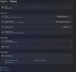
And there were a couple of occasions where an errant click sent personal data to a Bing search. Had to turn all that off.
To me, the worst thing the Settings App does is, when I think I'm clicking on a setting, it opens a fucking web page!!!
Avast, me hearties! Thar be links!!!

And there were a couple of occasions where an errant click sent personal data to a Bing search. Had to turn all that off.
Upvote
90
(91
/
-1)
This is what is going to happen. The new settings app is great but also has some serious holes in functionally, especially on network settings.Exactly. Better brush up on your *.cpl command lines, folks.
Upvote
27
(27
/
0)

